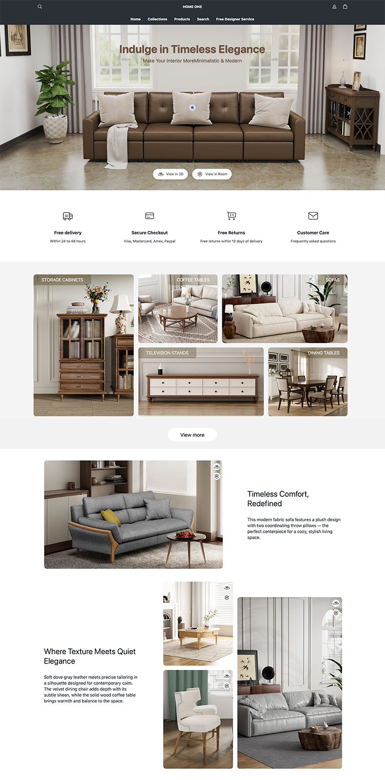
Maison
Powerful, feature-rich, and designed to drive conversions and boost sales.
$300
OS 3.0 · Developed by RoarTheme


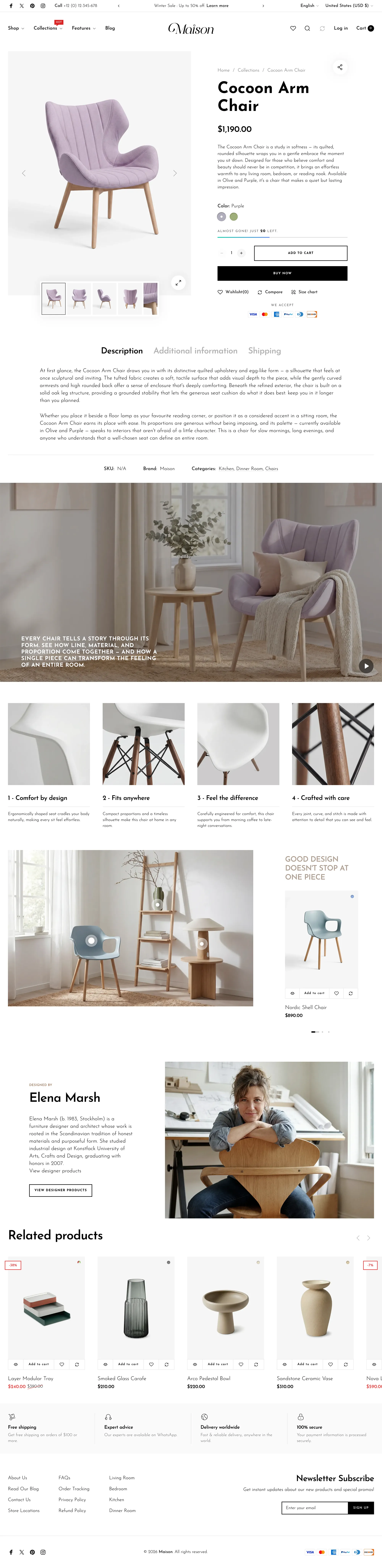

Powerful, feature-rich, and designed to drive conversions and boost sales.
$300
OS 3.0 · Developed by RoarTheme
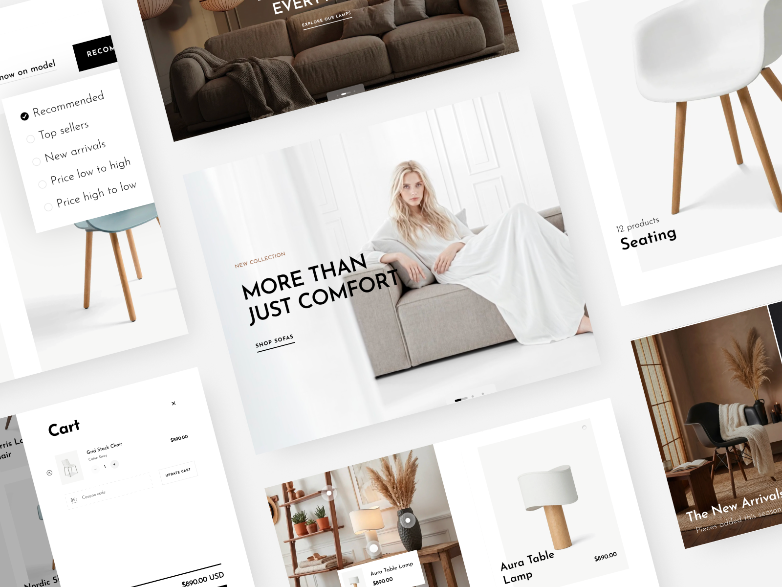
Customizable Layout Design
Easily adjust homepage layouts and page elements to match your brand style and deliver a polished storefront.
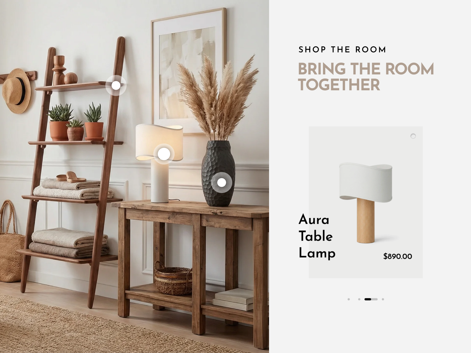
Immersive Shopping Experience
Turn lifestyle photos into shoppable scenes with Shop the Look hotspots, connecting customers directly to the products they love.
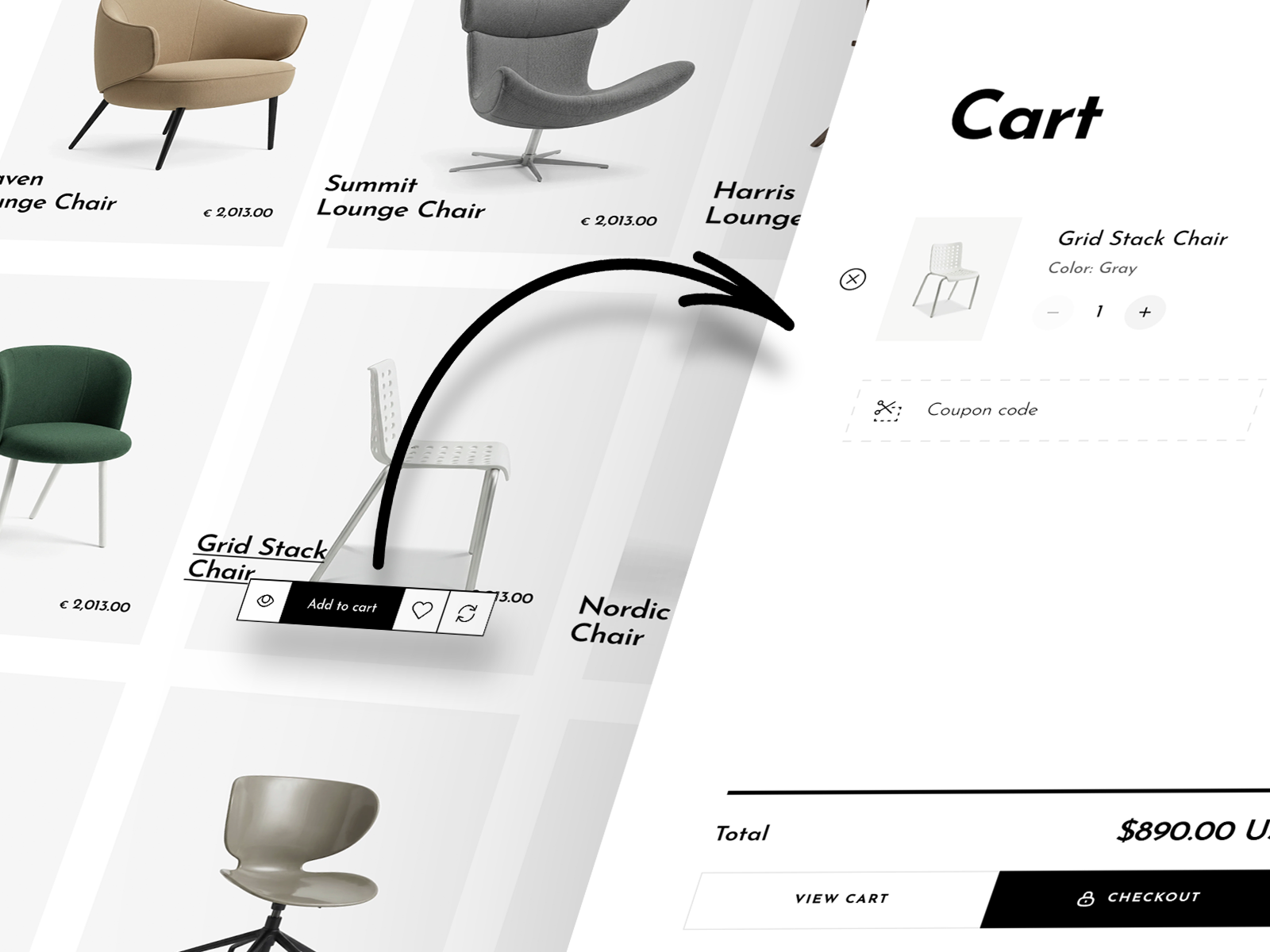
Boost Sales Conversion
A slide-out cart and quick-add buttons reduce checkout friction, turning page views into purchases effectively.
Cart & Checkout
Promotion & Marketing
Product display
Navigation
This release adds Smart Search Recommendations support — the app's Custom-style filters, category tree filters and its search popup — plus a Store locations section with Google Maps and a Stores page template. It also fixes the tablet card grid and the mobile product tab jump.
Added
- Added Smart Search Recommendations filter support: with the app's Custom style on, its Vertical, Horizontal and Drawer layouts render on collection and search pages, update results in place and match the theme's styling.
- Added category tree filters: nested filter values render as an expandable tree down to the platform's six levels, so app-defined category trees work in the theme's filters.
- Added a "Search app popup" option to Search behavior: the header and mobile dock search buttons open the Smart Search Recommendations popup, falling back to the search page when the app is unavailable.
- Added a Store locations section: up to 12 stores grouped by region, each with address, hours, phone, services, directions and coordinates, on a map image with hand-placed pins or an interactive Google map (seven styles, optional drag and zoom, zoom on the selected store, the theme's own pins) that loads on scroll; selecting a store in the list or on the map highlights it in the other.
- Added a Maps group to Theme settings for the Google Maps API key, with translated storefront notices when the key or a location is missing or the map fails to load.
- Added a Stores page template: banner, intro, store locations, flagship image with text, in-store services and a consultation banner.
- Added a Word strip block: a static or marquee row of words and images, with placeholder pills for items without an image.
- Added Collections and Ruler icons to the icon picker shared by the icon, accordion row, popup and selling point blocks.
Fixed
- Card lists use the wider tablet grid only when the mobile slider is enabled.
- The search page's search box no longer opens an empty suggestion panel on focus, since suggestions already show below the field.
- On mobile, opening a product tab no longer makes the page jump while the previous tab collapses.
- In the theme editor, the theme's own filters stay in place instead of being replaced by the Smart Search Recommendations filter, so layout changes preview correctly; the Filter layout setting notes that the app's layout applies on the storefront with Custom style on.
This release adds Mega Menu Builder support and fixes several reported issues, including the Contact Us form notification email, sticky buy button overflow and header layout on mobile.
Added
- Added Mega Menu Builder support: the header navigation now exposes the mount points the app expects, on desktop and in the mobile drawer, so the app menu renders in place of the theme menu.
Fixed
- Restored product card review stars on collection, search and home pages after the review app update.
- Fixed an issue where messages sent through the Contact Us form did not appear in the notification email.
- Fixed an issue where long product titles would overflow the sticky buy button instead of being neatly truncated.
- Text logos now shrink to fit on mobile instead of pushing the header icons onto a second line, and the cart count shows as a compact badge on small screens.
- Fixed invalid markup in FAQ, comparison table and order details.
- Fixed blog title size setting, shoppable media spacing and text effect fallback.
- Cleaned up duplicate CSS rules and editor labels.
This release adds two comparison sections — one hand-filled, one driven by live product data — plus per-item gift wrapping with gift messages on the order, a full-width buy bar for side-by-side product cards, and a fix for the search dialog reopening on its own.
Added
- Added a Comparison table section — a hand-filled side-by-side table for up to three products, with group headings, a Highlight differences toggle, a sticky product bar, and add to cart in every column.
- Added a Product comparison table section — pick any set of products and shoppers compare three at a time, swapping columns with dropdowns; rows read live product data and metafields (booleans become check/cross icons).
- Added gift wrapping — choose a wrapping-service product and the cart offers to wrap the order for its price per item; the wrap line follows the item count, gift messages land on the order, and the fee stays out of free-shipping progress.
Fixed
- Product card buy buttons now stretch into a full-width segmented bar when the product info is placed beside the image; the hover overlay inside the image keeps its compact style.
- The search suggestions dialog no longer reopens on its own when shoppers return to the browser tab after closing it.
28 new storefront languages, faster loading and instant variant switching, plus tighter integration with product reviews apps across the theme. Also new: sticky buy button, Scrollspy navigation, and metafield-driven product icons.
Added
- 28 new storefront languages — German, French, Spanish, Italian, Dutch, Portuguese (Portugal & Brazil), Swedish, Norwegian, Danish, Finnish, Russian, Polish, Czech, Slovak, Slovenian, Croatian, Bulgarian, Lithuanian, Latvian, Estonian, Greek, Romanian, Hungarian, Turkish, Arabic, Hindi, and Korean — joining the existing English, Vietnamese, Thai, Japanese, Indonesian, Malay, and Chinese (Simplified & Traditional) for 36 languages in total.
- New "Preload theme fonts" setting — keep it on (the default) for the current behavior, or turn it off when your page opens with an image or video so the hero media loads first.
- Instant variant switching — variant data and images are preloaded, and the gallery holds the current photos until the new ones are ready, so there's no more blank flash.
- Faster page loading on mobile — below-the-fold images and videos no longer compete with the hero during load, and videos are skipped entirely for visitors on Data Saver or 2G.
- Sticky buy button on product pages — once shoppers scroll past the buy button, a compact card slides in (bottom corner on desktop, docked above the bottom navigation on mobile) showing the product, selected variant, and price, so adding to cart is always within reach.
- New Scrollspy navigation section — a sticky bar of anchor links that highlights whichever section is on screen as visitors scroll. Each link can target one or several sections, the bar scrolls horizontally with edge fades when items overflow, and an optional back-to-top button is included.
- Product icons blocks — turn product specs from your metafields (material, dimensions, weight, and more) into an icon list. On product cards it displays as a grid or list, with an optional carousel that scrolls on hover; on product pages you can place it below the gallery or inside the product info column. You choose which metafield to read and how many items to show.
- Deeper product reviews integration — star ratings and review counts now appear on product cards, product pages, and in the Product comparison modal, so social proof follows shoppers throughout the store.
- Smarter mobile dock behavior — the dock now waits until shoppers scroll past the header, trades places with the sticky header as they move, and no longer covers the end of the page (the footer and sticky buy button both account for its height).
Fixed
- Locale and country selectors in the header and footer now respect their visibility conditions correctly.
- The Wishlist app button now works inside quick view, with the same behavior as on the product page.
- Quick view no longer shows leftover review widgets or the sticky buy button, and the review star rating now appears under the product title.
theme launched
You can install the theme for free and try some features. During the trial, you can design and preview the theme using real data from your store, such as products.
If you decide to publish the theme to your store, just pay a one-time fee of $300 to gain access to the theme for your current store, along with future version updates.
The images, videos, and plugins in the theme demo store are for display purposes only. The purchased theme package does not include these media or plugin content.